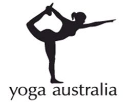
Does your corporate logo cover a continent?

112 years ago Theodor Tobler and Emil Baumann invented the chocolate bar Toblerone. The name is a play on the names “Tobler” and “Torrone”, the Italian word for honey and almond nougat.
It is one of the most recognizable brands in the world and anyone that has travelled through a major airport will almost certainly have seen the famous chocolate bar produced by Kraft Foods for sale in one of the duty free outlets.
One of the most important aspects of a successful brand is the logo.
The Toblerone logo is well known but do you see an animal hidden inside it?
Toblerone originated in Bern, Switzerland – a city whose name is rumored to mean, “City of bears”. Look at the logo again closely and you will find a bear facing to the right and stood on its hind legs.
Although I’m biased I love the ExP logo. According to the designers it is fresh, sharp, simple and easy to remember. Also, the “ExP Man” in the middle emphasises the people aspect of the business.
It’s great but there is another logo which I think is extremely clever.
If you look at the Yoga Australia Logo what do you see?

At first glance the logo may look like a simple picture of a woman doing her yoga exercise but if you look at it carefully the body posture is creating the Australia Map.
A great design and thankfully I didn’t pose for it as the map would have looked like a crumpled mess.


