Should you do a u-turn if you see a GAP in the market and it’s out of the blue?
According to dictionary.com the definition of a U-turn is
1. a U -shaped turn made by a vehicle so as to head in the opposite direction from its original course.
2. a reversal of policy, tactics, or the like, resembling such a maneuver.
For anyone that’s looking for a current example of a branding u-turn then I’d recommend looking at what has happened since the US clothing and accessories retailer GAP introduced their new logo last week.
GAP Inc, which was founded in 1969 in San Francisco, is home to a number of brands including Old Navy and Banana Republic. Their most famous brand though is that of GAP itself.
GAP has approximately 3,100 stores around the world and last year had revenue of nearly $15 billion.
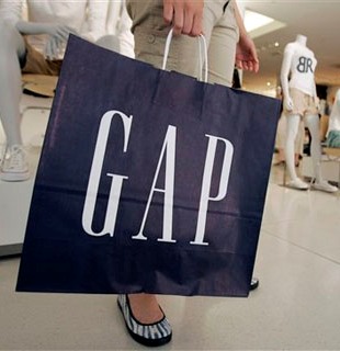
They are a great brand and their “blue box logo” (shown above on the GAP shopping bag) is one of the best known logos in the fashion world.
They decided however to change the logo and introduced the new logo shown below. Now, what do you think of the new logo? Which one do you prefer – the original one or the new one?
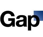
Personally I think that the new one looks as though it would be more suited to a high tech or consultancy company. The original one seems to better match their concept of clothing being laid back and traditional.
Following the launch of the new logo last week there was uproar on social media sites such as Twitter and Facebook with people demanding that the old logo be brought back.
The upshot is that on Monday GAP released a press release where they announced that the new logo would be withdrawn and the previous one reinstated.
In the words of the President of GAP Brand North America there was “an outpouring of comments from customers and the online community in support of the iconic blue box logo.”
A decision was therefore made not to use the new logo but to revert back to the previous one.
Was this a company listening to its customers and giving them what they wanted or was it a company that didn’t speak to their customers enough before making the change? There will be arguments both ways.
We shouldn’t forget the cost of this u-turn.
There would have course have been the fee GAP paid to their branding agency (probably ex-branding agency now). A quick straw poll in the office felt that the fee paid for this particular design should have been in the region of £10.
There would also have been the costs of redesigned packaging and signage with the new (now old) logo on it plus of course all the management time.
They say that “there’s no such thing as bad publicity”. I’m not sure GAP’s Branding agency would agree with this.
